Why Are The US Discworld Book Covers Absolute Pants?

Welcome to the Sir Terry Pratchett Forums
Register here for the Sir Terry Pratchett forum and message boards.
Sign up
Dec 31, 2008
1,289
2,100
Japan
#1
I believe this question is also linked to the recent introduction of chapters in Discworld books, but feel it deserves a thread on its own.

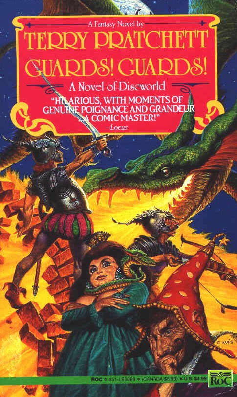
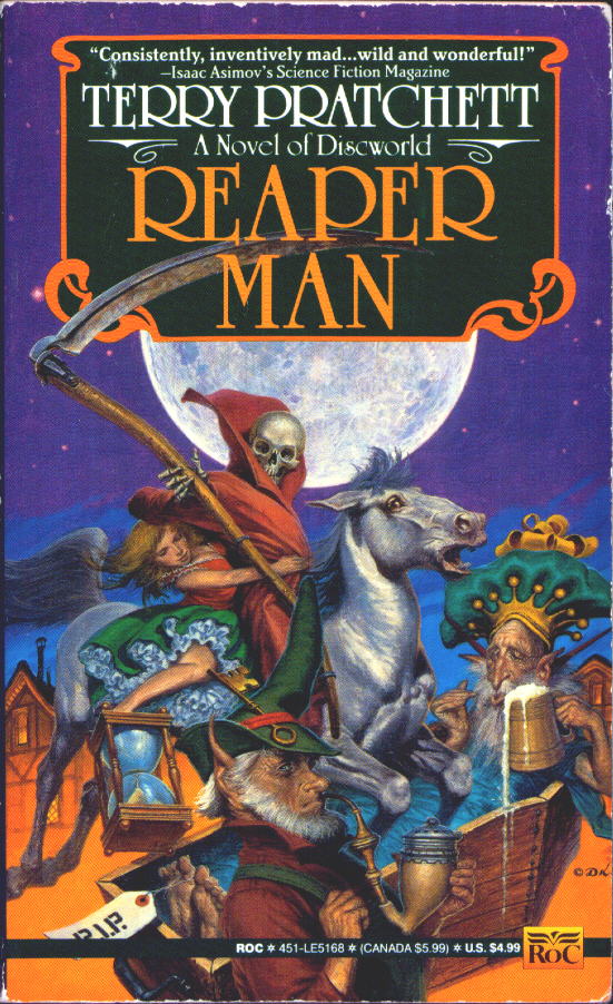
It has already been stated on this forum that TP himself asked for the Paul Kidby UK cover of Unseen Academicals to be turned into sepia from b & w. So in the UK he has complete control over the covers. Yet the US Unseen Academicals cover posted recently is complete pants, drawn by someone who doesn't even understand the rules of the footy.

Here are 3 more examples, in which ALL the US covers are pants.


WHY?
 
Aug 29, 2008
559
2,425
Bridgwater Somerset
#2
US tastes are seen as less sophisticated than the European or UK reader so simplified graphics are used so to not over excite the US buyer.... only joking! :laugh:

Probably something to do with copyright on the Art work..! o_O:
 

Jan Van Quirm

Sergeant-at-Arms
Nov 7, 2008
8,524
2,800
Dunheved, Kernow
www.janhawke.me.uk
#3
Not even that - it's demographics and what's gonna sell best.

As a sometime graphic artist I can see merit in having the different cover art as the markets aren't the same. I actually I quite like the Thud one as it goes back to the virtually prehistoric origins of footie in a way that's suitable for A-M, but then I don't rate any kind of sport unless there's lots of mud involved and astroturf is anathema - as chris will tell you :p
 

Jan Van Quirm

Sergeant-at-Arms
Nov 7, 2008
8,524
2,800
Dunheved, Kernow
www.janhawke.me.uk
#5
I meant rugby actually - 8)

Mud-wrestling seems be more of a masculine spectator sport and all I can think of there is how much they're gonna clog up the plug-hole in the bathroom afterwards - luckily there's not much in the way of clothes washing though :laugh:
 

Omnia

Constable
May 28, 2009
52
2,150
Essex
#6
I don't think it's quite accurate to say that the covers appeal to the National demographic ...I suppose it depends on individual tastes really ...I mean, I agree that the American covers aren't as good as the UK covers, but on the other hand the UK now also has the black and silver photographic covers, which I kinda think misses the demographic the books are actually aiming for.

(I also think that I've failed to make much sense in this post :oops: )
 

Addams

Lance-Constable
Jul 16, 2009
12
2,150
#7
The Thud one is especially ugly allright and sadly that's the one i have.

And i'm not even a yank. :laugh:
 
Jul 25, 2008
720
2,425
Tucson, Arizona, U.S.A.
#8
I can't believe I haven't done my "soapbox rant" on the subject of covers on this board. Pooh--I'm not sure what "pants" implies--but I'll assume it means something like "whittle".

First, let me say that I am not a fan of Paul Kidby, and when I was a bookseller, I'd have been even less of a fan. The point of a cover (dust jacket) for a hardcover is to catch the customer's eye. And Kidby's covers only do that in a negative way. I know, I know--everybody (except me) gets a big kick out of figuring out who's who, or what picture, statue he's parodying. But that assumes that the reader is a) familiar with all of Pratchett's works, and b)doesn't mind busy, cartoon-like covers. Now I think that the British cover of Thud! (which is substantially different from his earlier ones) is brilliant -- artistically and from a bookseller's point of view. It's gorgeous and draws the reader's attention into what might be going on in this book. The HC one isn't particularly good--although it does pick up the troll element and has the virtue of being fairly simple. I've never seen the American HC of Thief of Time (and can't find a picture of it). But I think the cover of the paperback from HC is far superior to either of those you showed Pooh. I'll try (or Tony will) to post a cover as an example.

And then I will say that the whole American publishing world has become more and more profit driven. And that means they hire people right out of art school to draw their covers. Obviously, some of them have never read the book and/or know nothing about the country where it is set. One of my favorite examples of that is the J.A. Jance Partners in Crime. This is the first one where she partners her Seattle and Cochise County, AZ detectives. The cover is quite striking-- dove gray with copper colored lettering and a gorgeous copper colored photo -- but it's of Monument Valley which, though it is in Arizona, has absolutely nothing to do with the book, the characters, or the author.
 

Tonyblack

Super Moderator
City Watch
Jul 25, 2008
30,841
3,650
Cardiff, Wales
#10
Tiffany said:
I agree with Pooh, the American covers aren't as good as ours, in most cases, but I like both of these.

Funny that as we were talking about those particular covers. I don't like the way Tiffany's eyes have been done on the UK cover and I'm not keen on the Feegles on the US one. But they are both pretty good. :laugh:
 
Jul 25, 2008
720
2,425
Tucson, Arizona, U.S.A.
#11
I agree with Tony - and what a coincidence as we were talking about the covers. Both of these are good (and since it's our special book it really wouldn't matter what kind of cover it had). But I don't like Tiffany's eyes on the UK one and I've never liked the British feegles all that well--but I agree--either of these will do nicely. :laugh:
 
Oct 13, 2008
2,118
2,650
Devon
#12
Like Tony, Tiffany's eyes, I think are warmer in the American version & her expression softer,. In the American version she looks like she is supposed to be, a young girl child, but I prefer the Feegles in ours. :laugh:
 

Catch-up

Sergeant-at-Arms
Jul 26, 2008
7,734
2,850
Michigan, U.S.A.
#13
:laugh: Mspanners you made me laugh! And, in a way, you're right. The Kirby/Kidby covers were considered too busy looking and, as Sharlene explained, it was thought they'd put off American buyers. However, why they had to be so plain is a little beyond me. I do have to admit that the US cover of Small Gods will always hold a special place in my heart, because that's the first DW book I ever read.
 

Dotsie

Sergeant-at-Arms
Jul 28, 2008
9,068
2,850
#15
Tina a.k.a.SusanSto.Helit said:
i hated the Josh Kirby covers, they were busy as hell and looked, frankly tawdry to my eye. I like Paul and his work.
I agree. As for the Hat Full of Sky cover, it looks to me like the American artist has just copied the British version. Possibly, because he/she didn't know what the book was about.
 

Cheery

Sergeant
Jun 22, 2009
1,280
2,650
30
Switzerland
jellymish-art.tumblr.com
#16
Tina a.k.a.SusanSto.Helit said:
i hated the Josh Kirby covers, they were busy as hell and looked, frankly tawdry to my eye. I like Paul and his work. Cheery has an intensely good amount of skill. I am very impressed by her work, and also jealous of her trip to Greece. :laugh:
Hello, everyone, I'm back! (harr harr)
Thanks for the compliment, and we've had a beautiful week over in Zakinthos. But I couldn't stand the heat, especially in the afternoon. It went up to 42 degrees o_O . We probably spent more time in and on the water than we did on land :laugh:.
Now, about the Josh Kirby covers; I thought the business was quite funny and while reading the book you could actually go and search the cover for characters :laugh: . I actually like both the same, up to the point of character designs. It seemes that there is more thought behind Paul Kidby's way of drawing the characters.
 

kakaze

Lance-Corporal
Jun 3, 2009
488
1,775
#18
In most cases I prefer the Kirby covers, except that they're a little bit too cartoon-like.

There's another artist who's (I think) done a good job, particularly with Reaper Man.


I've never liked the way Paul Kirby depicted Death.
 
Dec 31, 2008
1,289
2,100
Japan
#20
The covers are OK artistic wise, but to me, they don't get across the idea of humour. They don't tell me "This is a funny book!". When I looked at those covers I thought "Lord of the rings".

Who's the Rincewind looking wizardy guy at the bottom of Guards Guards meant to be?

And Carrot looks a bit "girlie".
 

User Menu

Newsletter