New versions
- Thread starter Who's Wee Dug
- Start date
Welcome to the Sir Terry Pratchett Forums
Register here for the Sir Terry Pratchett forum and message boards.
Sign up
I'm thoroughly unimpressed with the cover art for these. So, people won't be smart enough to know which series a book belongs to unless basically ever cover in the series uses essentially the same design elements with a little variation? Maybe Kirby went over the top at times, but at least each cover of his Corgis was visually arresting.
Hi, gaspodescrew.
They also misuse the word "branding" to refer to things that are merely similar. A true brand is exactly the same every time, like a logo. It's not a brand, it's a style.
Admittedly, covers have to do a lot of work. They have to be recognizable from five feet away in a bookstore, and reduced to less than one inch in height on a computer screen, and still make some sort of impact. I think the best ones have two pictures - the one you see when you look at it full size, and the embedded one you see when you look at the tiny version. Pareidoleia can make even a vague shape into a face and thus attract your attention. Now if only they would make the title legible.
On the other hand, they are ebooks, and while a nice cover is pretty, I would assume that the people buying them bought for the name of the author and the title of the book, not the picture.
Hi, gaspodescrew.
On the other hand, they are ebooks, and while a nice cover is pretty, I would assume that the people buying them bought for the name of the author and the title of the book, not the picture.
On the other hand, they are ebooks, and while a nice cover is pretty, I would assume that the people buying them bought for the name of the author and the title of the book, not the picture.

Rant--you can skip this.
I have a large collection of Discworld editions. I would buy the US hard cover edition to read it ASAP, the US SF book club edition [sometimes easier to get than the standard one, and often better covers], the UK hc edition to see the differences in the text -- often very large, though that ended when they started printing them at the same time [but still, some changes were made]. Then the paperback editions [both UK and US , when available] for ease of carrying, and newer ones for the new covers. I have an early pb of TCoM with a non-Kirby, non-Kidby, non-book club cover picture.
Until I figured out that Kirby was hiding a different picture in his weird covers, I hated them. I still prefer the early Kidby ones before he forgot how to draw. I actually liked the US "simple icon" covers-- they were better than some of the hb covers, IMO. At least they were recognizable from a distance and the icon had something to do with the story, and they were brightly colored so you could find them inside a bag. [Why do they make bags with stygian black interiors? and then make everything you might carry covered in black?]
Even the black covers with a photographed object were trying to tell you something about the book, even though their stated purpose was to let people read without being attacked emotionally by family and colleagues who sneered at anything with a fantasy. cover--or, in some cases, anything that wasn't depressing.
So the worst cover IMO was the one with Vimes walking through a mirror and losing his clothes, and that was mostly because Sir pTerry hated Alice in Wonderland. Also it was a spoiler.
Likes:
Tonyblack
I still prefer the early Kidby ones before he forgot how to draw.

So the worst cover IMO was the one with Vimes walking through a mirror and losing his clothes, and that was mostly because Sir pTerry hated Alice in Wonderland. Also it was a spoiler.
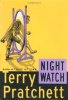
Also, was this a cover for "Night Watch"? If so, I agree - and I think the classic cover is best.
Rant--you can skip this.
So the worst cover IMO was the one with Vimes walking through a mirror and losing his clothes, and that was mostly because Sir pTerry hated Alice in Wonderland. Also it was a spoiler.
So the worst cover IMO was the one with Vimes walking through a mirror and losing his clothes, and that was mostly because Sir pTerry hated Alice in Wonderland. Also it was a spoiler.
Sorry, what do you mean? I'm confused.
The arms began to be curved rather than bend at the elbow, like cartoon characters. Faces became almost expressionless.
I don't think I've seen this one. Do you have a link or picture to share?
Also, was this a cover for "Night Watch"? If so, I agree - and I think the classic cover is best.
Also, was this a cover for "Night Watch"? If so, I agree - and I think the classic cover is best.
Kidby started well, with recognizably different character faces, body parts that had observable structure- bones, muscles, joints, etc. But over time, the characters on the covers all started to have the same face. He even said he drew them looking in a mirror. Especially, they all have the same nose, with a wider area at the top where most people's noses get noticeably narrower.
The arms began to be curved rather than bend at the elbow, like cartoon characters. Faces became almost expressionless.
The arms began to be curved rather than bend at the elbow, like cartoon characters. Faces became almost expressionless.
Yes, it was Night Watch.
View attachment 3275
View attachment 3275
I agree. I would even argue that repetition settled in near the end. Kidby's covers of the first editions of Snuff and Raising Steam are so similar (goldish colored central characters driving or operating some kind of blue-hued mechanical device with goblins by their side) that one might accidentally choose the wrong book from a bookshelf if they weren't looking closely.